Urban Logistics
// Creating an interactive dashboard with dimensional charts and crossfilters
read 6 min (1324 words) / write May 12, 2016

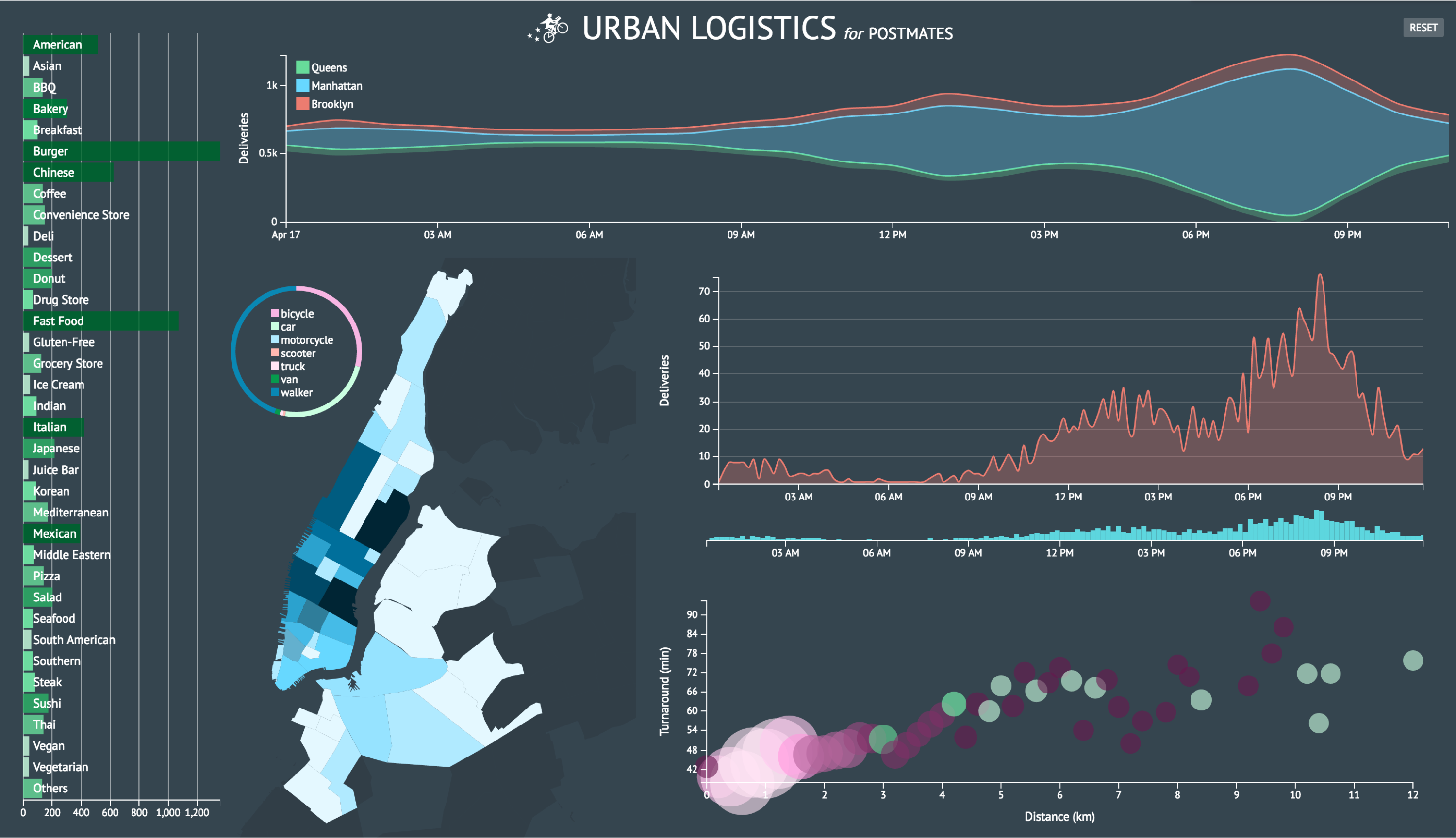
Urban Logistics is a sample data visualization dashboard for marketing and growth analysis using generic courier delivery service data provided by Postmates.
A technology agnostic approach
I used dc.js and Crossfilter to create an interactive dashboard with multi-dimensional charts. I prioritized these data visualization libraries over D3 because I wanted to offer a tool for others to derive their own insight from the data rather than create a biased presentation of what I thought the data meant. D3 was still essential to the project but I also wanted to learn a new data vis stack.
Crossfilter is powerful for exploring large multivariate data sets and because I was unfamiliar with the information I was working with, I wanted to create a tool to help me understand it. Using dc.js allowed me to implement a dynamic user interface over the Crossfiltered data.
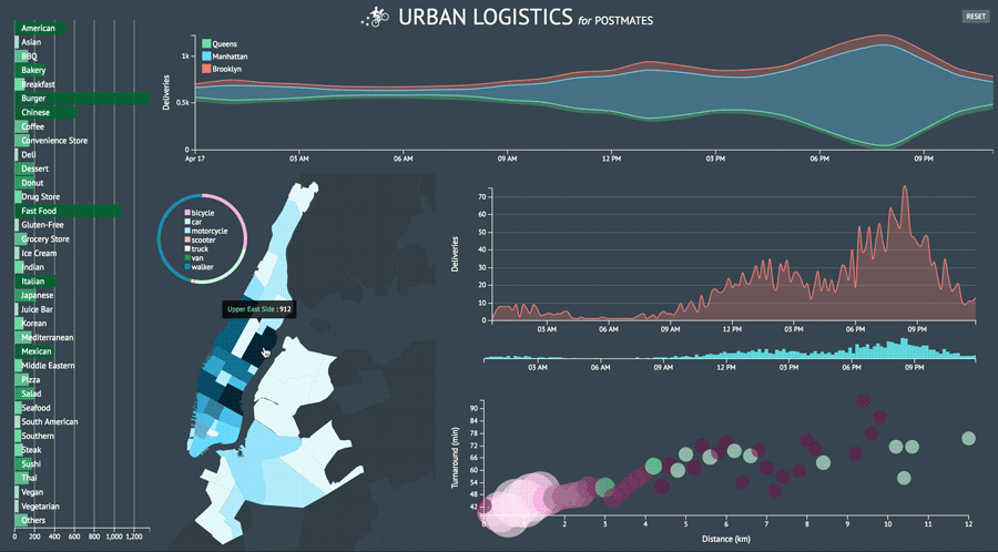
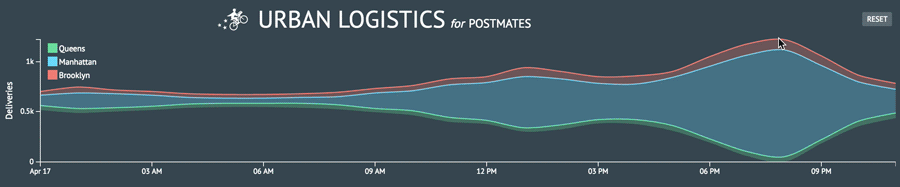
As a proof of concept, I began with the simple task of creating a stacked area chart, motivated by the header image on Postmates’ engineering blog.

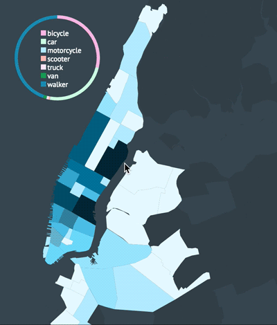
I was initially curious where courier deliveries were ending up around New York. I primarily wanted to capture the color story from the graphic above and in order to do so, I needed 3-5 data layers. It was perfect that there are five boroughs and I had all the longitude and latitude data I needed. However, coordindate-to-borough mapping was not readily accessible information so I had to figure out how to parse the coordinates in order to produce accurate location names. The dataset I was working with was also limited to particular delivery zones that spanned across three boroughs. Nonetheless, I had enough layers to create a simple the stack chart.
Map hunting
I initially considered creating a simple Node service or worker that would make a request to the Google Places API for each dropoff coordinate. Unfortunately, Google does not readily provide neighborhood data.
GeoJSON data from the New York Department of City Planning turned out to be the key and I could leverage D3’s polygon extension library to pinpoint each coordinate. The idea was to find which GeoJSON polygon enclosed each dropoff coordinate and by cross-referencing a Google map as well as nyc.gov, I was able to identify each community district and borough.
This approach worked out well for my MVP but several thousand coordinate points were being left out of the analysis. Turns out Zillow had more granular neighborhood boundary datasets although this switch would require some shapefile-to-GeoJSON conversion. Mike Bostock’s classic Let’s Make a Map gist and Jim Vallandingham’s From Shapefile to GeoJSON tutorial made this task effortless.
Zillow’s map data was great because I now had a level of detail allowing me to zoom into neighborhoods instead of community districts. However, it was still pretty frustrating because a few zones missing (not quite sure why although it could be that the regions missing are areas where deliveries cannot be made such as large parks or airports). Cross-referencing the missing patches against my raw coordinate data and Google Maps, I found that Greenpoint, NY was a huge missing region.
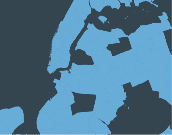
Luckily I found others were dealing with the same problem and I decided to create my own custom Greenpoint neighborhood polygon. For this reason, I would say the map data is not 100% accurate but I do think it’s a good rough estimate.
I should also note when parsing the data, if the pickup and delivery coordinates could not be found via polygon triangulation, I resorted to the courier’s starting point to fill in the data points. If a pickup point was identified but no dropoff point, I filled in the dropoff location using the pickup location and vice versa. The methods I’ve described here (using D3-polygon, etc.) should help inform the precision of my map render.
In a future iteration, I would spend more time investigating the missing coordinate data.
Reducing complexity
Generating the map data was a larger task than I anticipated so I decided for the rest of the project, I needed to simplify my approach and head straight for an MVP.
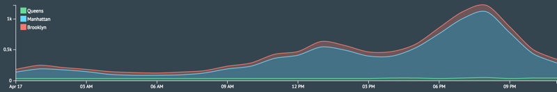
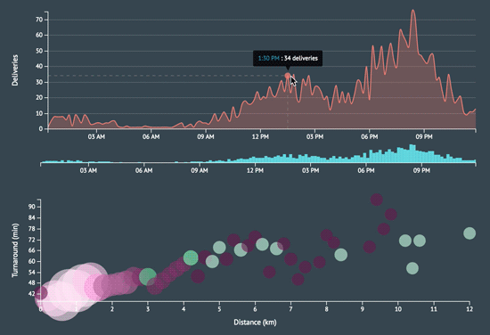
I created the area chart I initially sought to do and now I wanted to push how I was presenting the number of deliveries per hour in each borough. I wanted to morph my line chart into a stream graph. It’s a type of visualization that can be aesthetically polarizing and challenging to decipher but that just made it all the more provocative for me to try and implement.
Now it may seem that I have a somewhat loose concept of MVP… I emphasize that had very clear learning goals I wanted to accomplish and I was determined to push for something both challenging and enjoyable. While I was complicating the project more than it probably needed to be, I find that’s really the essence of a great data visualization project: one that captures the spirit of being able to take all this complex data, thousands and thousands of points, and distill it into something so seemingly simple. And that’s what I find so fun about working with large sets of foreign data. It definitely kept me going and at the end of the day, I’m very happy with the challenge I took on.
Some thoughts
After burying myself in the dc.js docs (it’s really well documented!), I was able to piece together the DC implementation of the D3 stream graph. I now had a firmer grasp of how to render the other charts I wanted by navigating the API and relying on my experience with D3. I even answered a Crossfilter question on StackOverflow and was selected as the best answer!
In an attempt to keep my code as modular and functional as possible, I spent some time refactoring my crossfilter dimensions and groups. In doing so, I ended up breaking the filtration capability and elasticity of my models. This FAQ ended up becoming an invaluable asset. I learned to create fake groups so dc.js could play nicely with Crossfilter and also that I needed a unique dimension for each chart I wanted to filter.
Perhaps the biggest time sink was working with the D3 scales, chart axes, legends, and tooltips but what’s new 😝? I think those will forever be a pain. I learned a lot by adopting a completely new data visualization stack and it was rewarding to create something that is both aesthetically and intellectually stimulating.
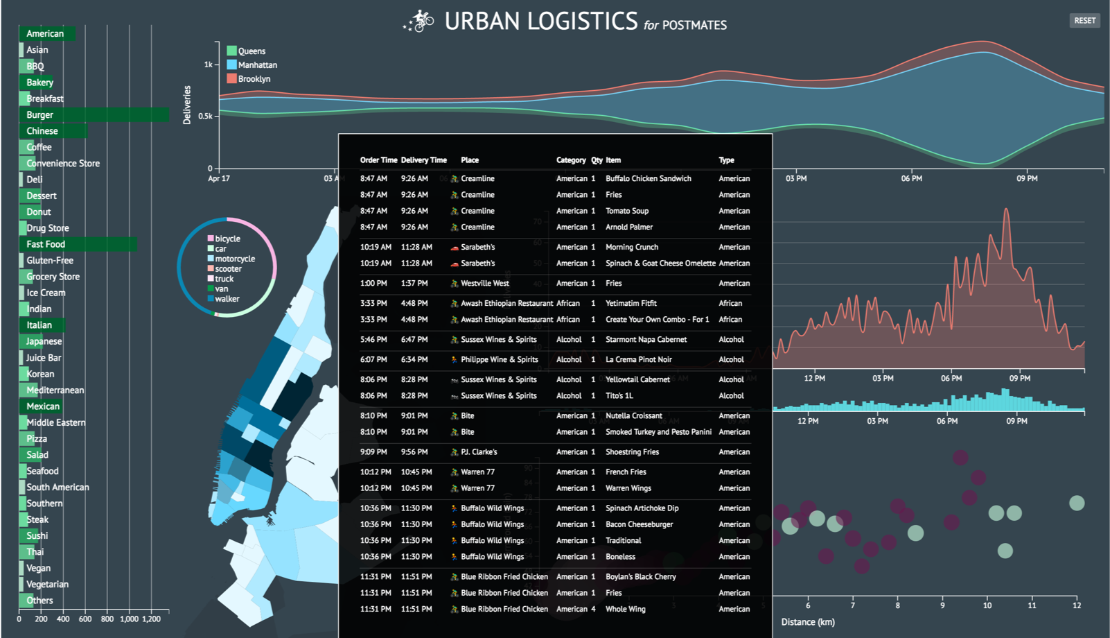
The dashboard came along way after adding custom styles to each chart (see old MVP above). If I could change one thing about my code, it would be the way I decoupled my charts. I separated my concerns as much as possible but I still ended up with the proverbial spaghetti code. I would love to componentize each chart in a future iteration perhaps by using require.js (ES6 modules can’t come fast enough!). I used require.js to factor out utility functions but it will take a little more effort to modularize each chart. For now, since no charts are being reused, I’ll leave all charts in the same script file until I have more time.
I’m looking forward to more data viz projects and hope to jump into even more charting libraries in the very near future. Stay tuned!
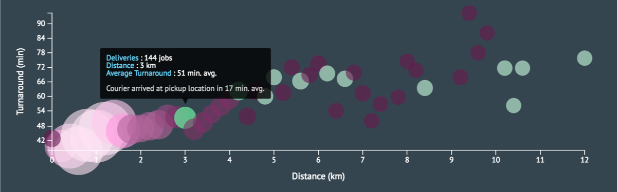
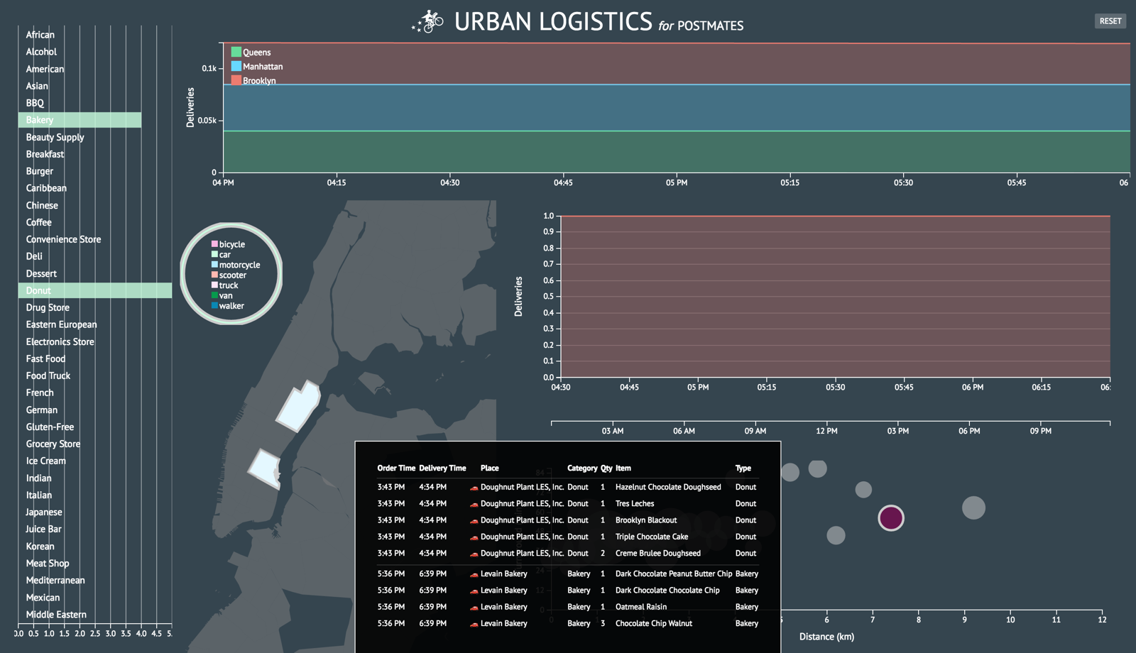
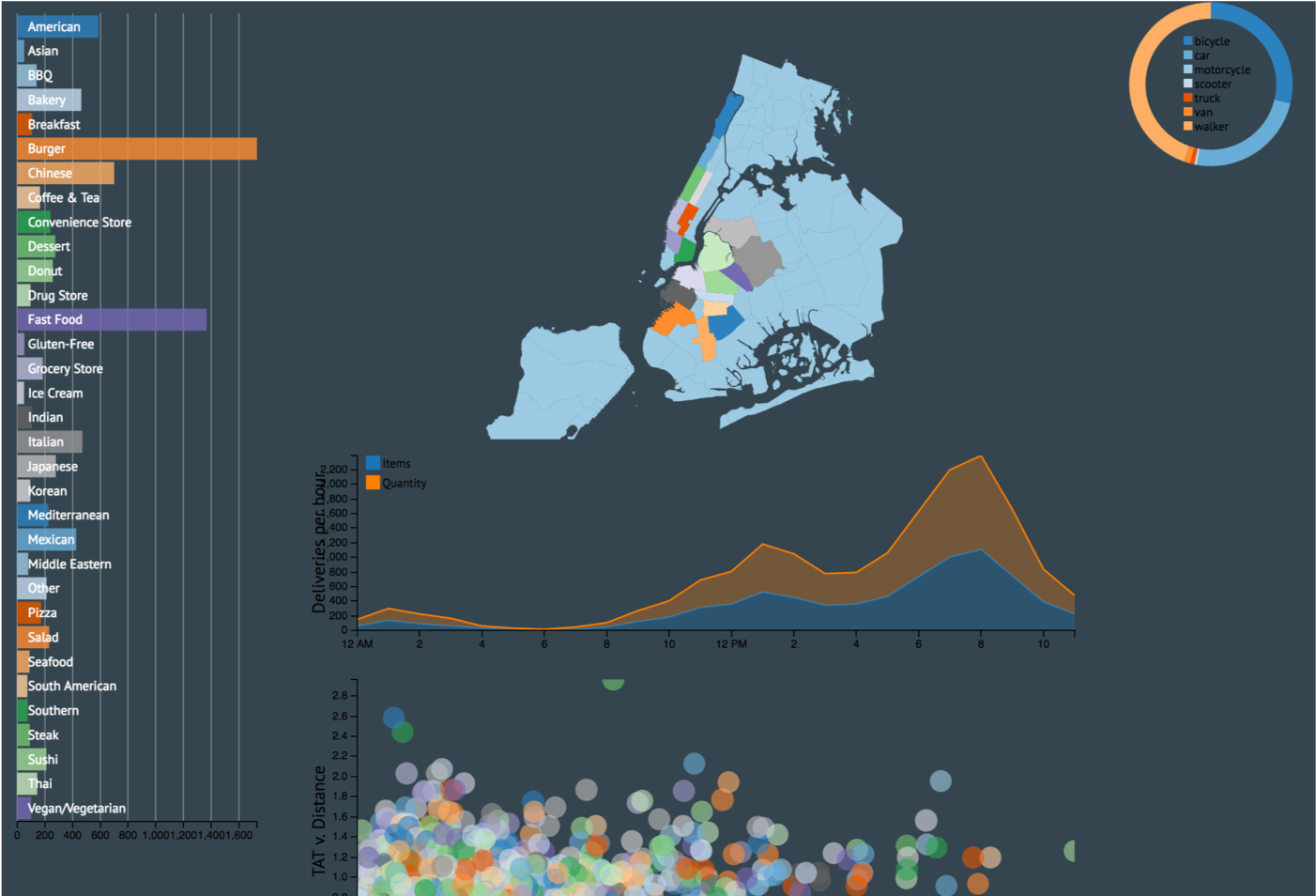
A few more screenshots